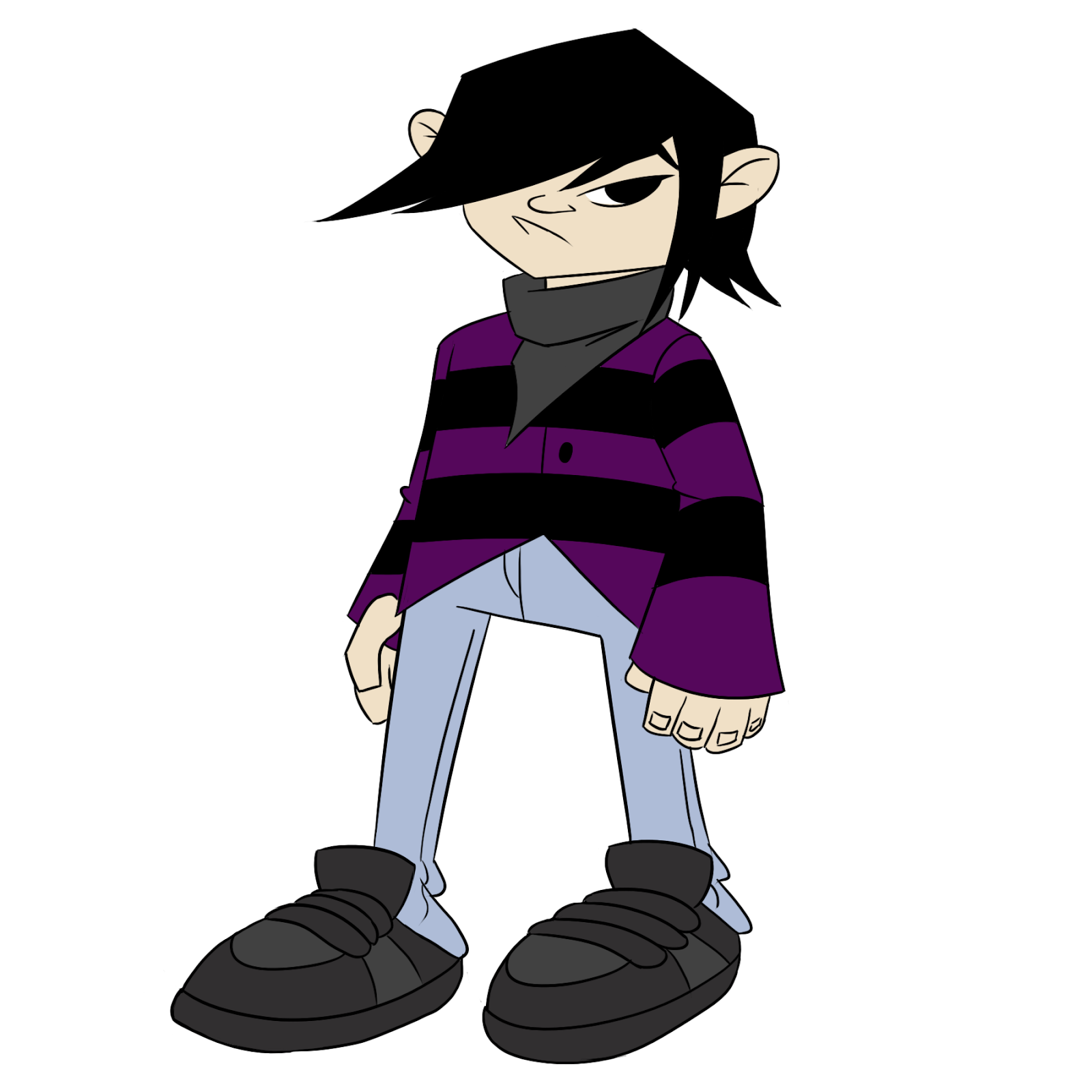
I have come across an interesting competition brief that is open to anyone. It's about what it means to be human and it can be a narrative or anything as long as it's creative. I plan to look into a few ideas I can use for this brief. This will be a great way to get my name out there so I will be entering this competition once I finish my animation.
Monday, 31 March 2014
Thursday, 27 March 2014
Lux Animation
I decided to discontinue the Suzuki animation as I couldn't think of anything suitable for their brief. Instead I decided to do the Lux animation instead. This one wont be ready in time for the deadline so this will be purely used for my final project and nothing else.
Lux Brief:
Since Lux do shampoo products, I plan to create a animation based on how beautiful your hair can look with Lux shampoo.
This is how I envisioned the story would go after some discussions with my tutor:
After agreeing with the story, it was time to go about the final animation. My animation consists of Photoshop work and Toonboom for animating.
Here are the Photoshop images that will be used. The parts I haven't drawn in Photoshop will be parts that I will be animating in Toonboom.
Lux Brief:
Every
woman wants to express her beauty and a LUX woman is no exception. She is
confident, she feels beautiful and feminine and believes that she is born to
shine. People notice her wherever she goes: her beauty is mesmerizing and
sparks admiration. And she knows it! How should she express her beauty to make
her shine even brighter so that people would love and adore her even more?
Show us, through an inspirational and insightful
video/animation or an exquisite poster, the ideal beauty moment for a LUX
woman, when she fully expresses her beauty, which will trigger more love and
admiration around her
Of
course, for her, this is an ongoing journey. She is looking for different ways
to make her beauty stand out. She gets some intriguing and exciting suggestions
such as:
Use
her CHARM: Her beauty is part of her charm, that inevitably impacts others
around her
Take
pride in her ELEGANCE: It is more than beauty. People recognize it from her
poise, her grace, etc.
Add
a touch of GLAMOR: there is a bit of glamor in whatever she does.
Now
it’s time for you to show our LUX woman the best way to put her beauty in the
spotlight. The above suggestions could be right or wrong and you can agree or
disagree. If you agree with one of the three, please base your work on it; if
you think of anything else that could work better for her, please show it in
your work.
Since Lux do shampoo products, I plan to create a animation based on how beautiful your hair can look with Lux shampoo.
This is how I envisioned the story would go after some discussions with my tutor:
After agreeing with the story, it was time to go about the final animation. My animation consists of Photoshop work and Toonboom for animating.
Here are the Photoshop images that will be used. The parts I haven't drawn in Photoshop will be parts that I will be animating in Toonboom.
This establishing shot will slowly pan into the woman who is applying her lipstick.
She has no lips here as they will be animated in Toonboom. She will be applying her lipstick in this shot.
This shot will have the woman unpinning her hair and her hair will gracefully flow down her back.
We'll then cut to two men minding their own business but then they'll suddenly look up at the girl in amazement as she enters the room.
A slow pan up will happen here to show how beautiful her hair looks.
This long shot will consist of the girl flying gracefully with her hair flowing behind her. She'll fly from one end of the office to the other whilst the men will stare at her in amazement.
The final shot, which I don't have a JPEG file of, will have another guy reading the news paper outside and as the woman leaves, he stares at her in amazement too. The Lux product will then fade in showing the shampoo she uses.
With the shots ready, I can animate them in Toonboom and then edit it in Adobe Premier and add music to it etc.
Thursday, 6 March 2014
Wild Grinders Storyboarding Progress
After looking over the script and practising the characters, I finally got work on storyboarding the script. This contains the thumbnails for the first 2 pages and the beginning of the clean up version which I will update during the week.
This is just another attempt at the Wild Grinders style. I wanted to keep practising the style until I got it down perfectly. As an aspiring storyboard artist, I have to learn to adapt to certain styles.
This is the thumbnail draft of the storyboard.
Finally here is page 1 of my storyboard. I will upload the rest once I have finished them.
Update: Here's page 2 of my storyboard.
Page 4
Finally, here's page 5
Update: Here's page 2 of my storyboard.
Page 3
Page 4
Finally, here's page 5
Subscribe to:
Comments (Atom)


